Think of K-nearest neighbors (KNN) like asking your neighbors for advice.
If you want to decide whether a house is “expensive” or “cheap,” you look at the k most similar houses nearby (same size, location, etc.). If most of them are expensive, you assume yours is too. That’s basically how KNN works.
A KNN plot is just a picture that shows how well your model is guessing.
There are two common ways you might see it:
1. Predicted vs. Actual Plot
- Each dot = one data point
- X-axis = the real (actual) value
- Y-axis = what the model predicted
👉 The goal: dots should fall close to a diagonal line (perfect predictions)
- Close to the line → good predictions
- Far from the line → errors
✅ GOOD MODEL
Predicted ↑
|
●
●
●
●
●______________→ Actual
👉 What’s happening:
- Points line up along a diagonal line
- Predictions ≈ real values
- Small errors
❌ BAD MODEL (Overfitting or noisy)
Predicted ↑
● ●
●
●
●
●______________→ Actual
👉 What’s happening:
- Points are scattered everywhere
- No clear pattern
- Model is inconsistent
2. Decision Boundary Plot (like your example)
This one looks more like a colored map.
- The background is colored to show what the model would predict in different areas
- The actual data points are plotted on top
👉 The goal: colors should cleanly separate the groups
- Smooth, sensible regions → good model
- Weird, jagged shapes → likely overfitting
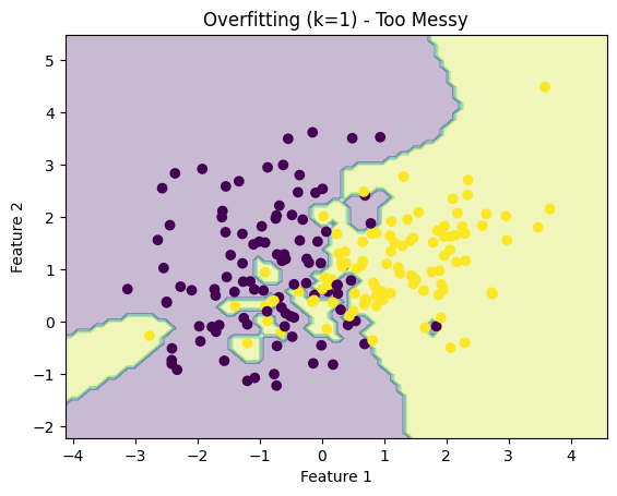
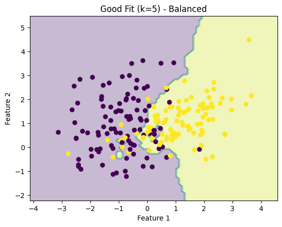
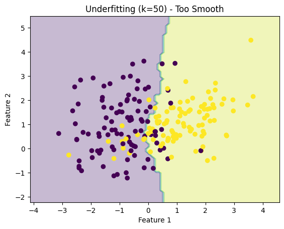
Here are three real KNN decision boundary plots showing exactly what we talked about:
How to read them:
1. Overfitting (k = 1) — “Too Messy”
- The boundary is very jagged and irregular
- The model is reacting to every single point
- Looks chaotic → poor generalization
2. Good Fit (k = 5) — “Balanced”
- The boundary is smoother but still follows the data
- Clean separation between the two groups
- This is what you’re aiming for
3. Underfitting (k = 50) — “Too Smooth”
- The boundary is almost a straight line
- Ignores local patterns in the data
- Too simplistic → misses important structure
⚖️ The “k” value (simple explanation)
- Small k (like 1 or 3):
- Listens to very few neighbors
- Can be too sensitive (overfitting)
- Looks messy and jagged
- Large k (like 10 or 20):
- Averages many neighbors
- Can miss important details (underfitting)
- Looks overly smooth
👉 You’re trying to find the sweet spot.
What to remember (quick intuition)
- Top (k=1): memorizing → overfitting
- Middle (k=5): learning patterns → good
- Bottom (k=50): oversimplifying → underfitting
✅ Why KNN plots are useful (big benefits)
1. Instant visual feedback
You don’t need to read metrics—just look:
- Are predictions close?
- Are groups separated clearly?
2. Reveals model mistakes
Outliers jump out immediately:
- Points far from where they “should” be
- Misclassified regions
3. Builds intuition
KNN is one of the easiest models to understand visually:
- You literally see how decisions are made
- Great for machine learning concepts
4. No assumptions about data
Unlike some models, KNN doesn’t assume patterns (like linear relationships).
The plot helps you confirm whether that flexibility is helping or hurting.
🧩 Bottom line
A KNN plot is like a report card you can see instead of read:
- If it looks clean and organized → your model is doing well
- If it looks chaotic or oversimplified → you need to adjust k or your setup